2013-11-06
Explanation
The Joke
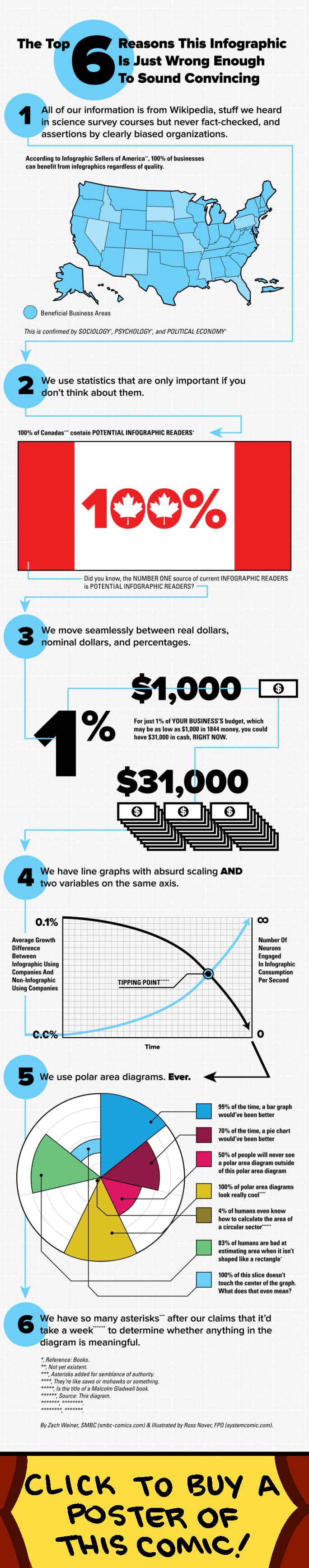
This comic is formatted as a satirical infographic titled "The Top 6 Reasons This Infographic Is Just Wrong Enough to Sound Convincing." It systematically catalogs common tricks used by misleading infographics:
- All information comes from Wikipedia, stuff heard in survey courses, or assertions by biased organizations -- sources that sound authoritative but are not fact-checked.
- It uses statistics that are only important if you do not think about them (e.g., "100% of Canadians are POTENTIAL INFOGRAPHIC READERS").
- It moves seamlessly between real dollars, nominal dollars, and percentages to make comparisons misleading (showing how 1% of a business budget can sound like either $1,000 or $31,000 depending on framing).
- It uses line graphs with absurd scaling and two variables on the same axis, with a dramatic "TIPPING POINT" label.
- It uses polar area diagrams (pie charts) excessively, noting that most of the time a bar graph would be clearer.
- It has so many asterisks and caveats that it would take a week to determine whether anything in the diagram is meaningful.
The Humor
The comic is a meta-joke: it is an infographic criticizing infographics, using the very techniques it is mocking. It employs flashy graphics, bold statistics, maps, pie charts, and dramatic formatting -- all while explaining exactly why these elements are misleading. The self-referential nature makes the criticism more effective and funnier than a plain-text essay on the same topic would be. Each numbered point is a genuine critique of how viral infographics manipulate data presentation to seem more authoritative and compelling than their underlying data warrants.
References
The comic parodies the explosion of viral infographics in the early 2010s, which were widely shared on social media. Polar area diagrams (also called Nightingale rose charts) were famously used by Florence Nightingale. Indifference curves and the distinction between real and nominal dollars are standard economics concepts. The "tipping point" reference likely alludes to Malcolm Gladwell's popular book of the same name.